Category Archives: Video

Three Important Services We Provide

by Kelsey Media Productions

These days, media is an enormous concern in advertising and marketing.

Companies know they have to innovate to reach new audiences. They are aware of the need for multichannel marketing that really puts their business in the right light, and gets them the visibility that they need.

But how do you go about doing that?

To a large extent, you need the right consulting firms and the right services to develop these new types of campaigns. Text, in many ways, isn’t enough anymore. You need visuals and multimedia components that you can stream in the right channels, put on the web, and generally use for engagement and branding power.

With that in mind, we offer these types of services to help clients to market themselves in this brave new world of digital media possibilities.

Video Production Services

Video is a large part of what we do. Our customized project management in this realm allows our clients to put together professional-looking footage that is useful in so many different ways. Some of this ends up getting streamed on places like YouTube, Vimeo, Hulu and other smart TV channels. Some of it ends up linked to Facebook, Instagram or Twitter posts. In other cases, people are tying it into their own websites.

No matter where it goes, companies need the help of third-party services with excellent production capabilities and more to deliver the results that are going to provide needed returns.

Music Soundtrack Production 

Here’s another part of what we offer to media clients.

Sometimes, what you need is a jingle or an audio piece that will help represent your business well.

Not all video companies do this kind of audio, but we do; we’re active in helping companies to come up with auditory taglines and rhythms that will attract the right attention.  We are also one of the few production houses locally who can provide you with a 5.1 surround production.

3D Animated Logo/Products

Another type of visual service that we do goes all of the way back to those ancient types of graphic projects that we saw with things like Flash 5 animation years ago. 

Fast-forward to the present, and companies are using much different tools for 3D and animated visuals.

One of the things we do is take the company’s existing logo or product and make it three-dimensional object we can then animate it, in order to show off the brand directly in a more compelling way.

Think about all of these services and what they bring to your business model. Then get connected to a firm like Kelsey Media Productions that knows how to get your brand and message in front of the right people, with competitive video and more. Have more questions or looking to be more noticed give us a call at 781-365-4800!

Kelsey Media Productions Receives 2022 Best of Burlington “Media Services” Award.

Burlington Award Program Honors the Achievement BURLINGTON February 10, 2022 — Kelsey Media Productions has been selected for the 2022 Best of Burlington Award in the Media Services category by the Burlington Award Program.

Each year, the Burlington Award Program identifies companies that we believe have achieved exceptional marketing success in their local community and business category. These are local companies that enhance the positive image of small business through service to their customers and our community. These exceptional companies help make the Burlington area a great place to live, work and play.

Various sources of information were gathered and analyzed to choose the winners in each category. The 2022 Burlington Award Program focuses on quality, not quantity. Winners are determined based on the information gathered both internally by the Burlington Award Program and data provided by third parties.

About Burlington Award ProgramThe Burlington Award Program is an annual awards program honoring the achievements and accomplishments of local businesses throughout the Burlington area. Recognition is given to those companies that have shown the ability to use their best practices and implemented programs to generate competitive advantages and long-term value.

The Burlington Award Program was established to recognize the best of local businesses in our community. Our organization works exclusively with local business owners, trade groups, professional associations and other business advertising and marketing groups. Our mission is to recognize the small business community’s contributions to the U.S. economy.

SOURCE: Burlington Award Program

CONTACT:Burlington Award ProgramEmail: PublicRelations@selectionstown.com

Visit company website at KELSEY MEDIA PRODUCTIONS

How Long Does It Take To Make An Animated Video?

February 10, 2022 /by Karolina Szot

Each stage of the production process takes a different amount of time. The length of your video and complexity of the illustrations and motion design also factors in.  This outline presents a breakdown of what to expect during the explainer video production process. You’ll also learn how long each stage of the production process takes.

Explainer Video Production Process Timeline:

1). Pre-Production

2). Script

3). Storyboard

4). Voiceover + Auditions

5). Concept Art

6). Illustrations

7). 3D Animation

Pre-Production

Before you start looking for an animation studio or freelancer to make your custom animated video, spend some time getting clear about what kind of animation you want to create. Once you’ve spent some time identifying the important criteria, you’ll be better prepared to pick out an animator that can produce the video you want, within your desired budget and timeline.

While you’re in the pre-production stage, you should also spend some time organizing files like fonts, logos, icons, branding documents and more. 

Not sure which animation style is right for your video?  Read out our pros and cons list to learn what’s involved with producing different styles of animated videos:

Script

Under a normal production timeline, the script writing phase takes about 1 week for an animated video that’s 1 minute long. After the animator learns about your video idea, they will take 1-3 days to create the first draft of the script. Take a day or two to review the script and organize your feedback for the production team. Once the writer receives your feedback, they can typically turn around a revised script in 24 hrs or less. Scripts typically take 1-3 rounds of edits to get to the final draft.

If you are writing the script yourself, allow 1-2 weeks for your team to review it and contribute their feedback. Ensure everyone has approved the script before you share it with your production team.

Storyboard

The next step of the explainer video production process is to turn the script into a storyboard. A storyboard is a document that explains what visuals and what motion design needs to happen during every sentence of your script. It’s essentially a blueprint for the design and animation teams so that they know what to create. 

A storyboard for a 1-2 minute video typically takes 1-4 days to produce. Then, it takes about 2-3 days to review the storyboard with the client and incorporate their edits.

You can save money on your production budget by creating your own storyboard. We also have a free storyboard template and storyboard creation guide which you can download by clicking on the image below:

Voiceover + Auditions

Once your storyboard is approved, the next step of the explainer video production process is to get voiceover auditions for you to review. It takes about 1-3 business days to get voiceover auditions recorded and delivered from multiple artists. You should take a day or two to review the options with your team. Then, notify your animator about which audition is your favorite option. Tell your animation team if you want the voiceover artist to modify their tone when recording the full voiceover.

Your animation team will then get the full voiceover recorded in 1-3 business days. When the VO is ready to review, give it a detailed listen with your team. If you love the voiceover as is, let your animation team know. Otherwise, send them detailed feedback so that the voiceover artist will know which parts to rerecord. Provide specific instructions about how you want them to change the timing, energy or inflection used. It is also helpful to list what time in the recording the changes need to be made

Concept Art

After your storyboard is approved, the next phase of the explainer video production process is to create the concept art for your video. Depending on the size of your budget, you can expect to receive 1-5 different visual concepts showing how one scene of your animated video can be designed. This typically takes 2-5 days depending on the # of samples being created and the level of detail used in your animation.  

Once you receive your concept art, take a day or two to review the concepts with your team. Let your design team know which style you prefer. If you want to make visual refinements to the styleframe, now’s the time to speak up.  If you like design elements from multiple concepts, tell your design team. They can combine the best design elements into a single visual concept for you to review and approve. This typically takes another day or two for the designers to create and then run by you for approval.

Illustrations

Now that your concept art is approved, the designers will create the rest of the art for your video. It takes about one week to create all of the art for a one minute animated video. Give your illustrations a thorough and detailed review. It’s important you are happy with the art before animation begins. If you love it as-is, let them you know you approve the art. Otherwise, submit your feedback to the design team and wait 1-3 days for the update. It’s not uncommon to do a 2nd round of edits on the illustrations for an additional layer of polish.

Animation

When the art, soundtrack and voiceover are approved, the animation team will start animating your video. One animator can animate about one minute of 2D or 3D animated content in one week. Revisions can typically be turned around in 1-2 days after the animator receives your feedback. When you receive the first draft of their video, circulate the first draft among your stakeholders. It’s a good idea to get different people’s impressions and feedback. This way, when you come back with your list of edits, all the ideas are consolidated and can be addressed at once. Going through multiple rounds of revisions at this stage will likely increase your final production cost and the amount of time it takes to get your animation completed.

Post-Production

The final stage of the explainer video production process is called, “Post-Production.”  Post-Production includes adding little details like sound effects, or rendering out multiple versions of the video with slight variations (perhaps you want to show a different business location’s address at the end of each video). These kinds of edits are typically simple and take 1-2 days to process after the final draft draft is approved.

At Kelsey Media Productions we can make your vision a reality! Visit us now at KelseyMediaPoructions.com or call 781-365-4800!

Web Design Trends 2021: From Dark Mode to Motion

A good article for which web design trends will take the web by storm over the next year? Here are some trends to watch out for in 2021.

Portrait for Kelsie Rimmer  By Kelsie Rimmer
Web Design Trends 2021

Web design has come a long way in the last few years. The practice exists at the intersection of creativity and technology – two of the fastest moving industries in the world – so it’s no surprise that new web design trends and techniques are constantly emerging. So what are the latest trends in web design?

While there will always be certain aspects of web design that are here to stay – such as user-friendly navigation, data security, and fast load times – fads and fashions will continue to come and go. But keeping on top of the latest and greatest web design trends, styles and innovations, will ensure your website stands out in the ever-expanding online ecosystem.

So, from dark mode to interactivity, which popular web design trends will take the web by storm over the next year? We asked our Envato experts what makes a great website in 2020, as well as their hot take on the latest and greatest web design trends to watch out for in 2021….

01. Dark mode

Apple Website
Dark Mode – Apple Homepage

For a long time in web design, a white background was considered the only way to create empty space on a website or app. While some designers began adding darker themes and elements several years ago, the Dark Mode trend really took hold of the industry in 2020, and we expect to see it continue into 2021.

What Is Dark Mode?

Clock Strikes Twelve
Dark Mode – Clock Strikes Twelve Homepage

Used by large brands like Apple, Hublot, and even for individual portfolios like Clock Strikes Twelve, dark mode is a great way to add a modern, elegant touch to any website. As well as allowing designers to play with more creative elements, such as pastels and neon – two of the big graphic design trends of 2020 – studies have also shown that dark mode is better for both our battery life and our vision by it reducing blue light exposure.

“There seems to be a shift towards more products that offer a dark mode setting, or are only dark driven, based on studies that reveal the impacts of glare and blue light exposure, and on our treasured battery life,” says Envato UI designer Sean Feehan.

As well as being sleek, chic and easier on the eyes, dark mode is great for increasing contrast, and making design elements more visible. You can even add a dark mode toggle to your website – as seen in these examples from Johny Vino, Koos Looijesteijn and Adrian Verde Studio – to allow visitors to customize their experience.

Johny Vino - Dark Mode Toggle
Dark Mode Toggle – Johny Vino Homepage

“I think dark mode is definitely the trend that’s had the biggest impact on web design in 2020,” says Envato UX designer, Tahlia Giannopoulas. “Since Dark mode has become popular, I’ve seen several websites that have a small ‘Dark Mode’ toggle (switching between light and dark mode), which is a great yet simple way that a user can customise their experience.”

While originally designed around exclusively white and light color schemes, more and more neuromorphic designs – a divisive UX style drawing on skeuomorphism and flat design that’s often seen in iOS or Android UI – also incorporate the dark mode trend, which has quickly overtaken lighter color themes in popularity.

To cross over to the dark (mode) side, check out this Dashboard UI Concept Dark Theme by hoangpts, Finance Wallet Dark Mode UI Kit PP by angelbi88 and this Spate Ui Kit by cerpow on Envato Elements!

02. Collage & Mixing Mediums

Collage - City Circus Website
Collage – City Circus Homepage

Collage was one of the biggest trends to take over the graphic design and social media landscape this year, and it’s quickly caught on in the world of web design. The mixed media style returned to the spotlight due to digital artists and social media influencers, and was also adopted by many brands and web designers – including Chobani, City Circus and Urban Outfitters.

What Is Collage?

Collage - City Circus Website
Collage – City Circus Booking Page

Collage is all about mixing mediums such as photos, illustrations, graphics, motion and text to create an inspiring and eye-catching aesthetic.

Now that it’s moved into the digital realm, the collage trend has evolved into mixed media such as animated collage, large decorative fonts, artistic textures (such as paint brush strokes) and even animated distorted text, which generate some incredibly unique results.

“I think the concept of mixing mediums will only get bigger in 2021,” says Tahlia. “Heaps of people are now using drawing apps on iPads, and with digital brushes that mimic traditional paint mediums (such as watercolors, oils, gouache), the boundaries of digital art are being redefined. Also, the added convenience of having digital art already on your device (not having to worry about photographing or scanning it) means it’s easier than ever to share on the web.”

Collage - Urban Outfitters Website
Collage – Urban Outfitters Homepage

Collage is a trend that pairs well with minimal UX design – or even anti-design if you want to push those boundaries. Integrating mixed media and collage into your website design is a surefire way to add a splash of creativity to an otherwise ordinary experience and make your brand or business stand out.

To integrate collage into your next web design, check out this Brynn Creative Portfolio Theme, this Bridge – Creative Multipurpose WordPress Theme, or this Boldlab – Creative Agency Theme on ThemeForest. Or, check out these great collage-inspired items on Envato Elements!

03. Anti-Design

Anti Design - Roze Bunker Homepage
Anti Design – Roze Bunker Homepage

Warning: we know this trend isn’t for everybody!

If 2020 has taught us anything, it’s to throw all rules and expectations out the window. Anti-design is a trend that was spurred on by the resurgence of Brutalism in 2019, and the controversial style has more recently seeped into the realms of social media and pop-culture, as well as web and graphic design.

Anti Design - Play Type Homepage
Anti Design – Play Type Homepage

What is Anti-Design?

Described as ‘raw’, ‘unapologetic’ and even ‘hideous’, the anti design movement is all about embracing chaos and ugliness in protest of the traditional standards of ‘good’ design. It features experimental and asymmetrical layouts, exaggeration, distortion, layering and traditionally ‘ugly’ elements, which means it’s certainly not everybody’s cup of tea. But if you’re someone who likes to stand out from the crowd, there’s no denying that an anti-design website is a very effective tool for doing just that!

Anti Design - XXIX Homepage
Anti Design – XXIX Homepage

Many designers are now dabbling in the bizarre world of anti-design, which can be seen in the chaotic yet quirky website designs of Dutch brand Roze Bunker, and design studios Play Type and XXIX. Even Aussie artist Flume has taken a bright, bold and brutalist approach with his website. While this style always stands out (hopefully for the right reasons), effective web design is about balance. So, if you do choose to go down the road of anti-design in your UI, it’s important to ensure that the UX of your website is still simple, functional and user friendly.

Anti Design - Dynamic MTL Homepage
Anti Design – Dynamic MTL Homepage

“I thought the anti-design trend might die down, but I think ‘Breaking the Rules’ has evolved along with collage and mixed media,” says Tahlia. “I have come across a lot of different websites that are layering imagery, mixing serifs with san serif font, and using animation in an unconventional way. Yet, because of their great UX, they still make it work.”

04. Minimalism

Minimalism - ETQ Homepage
Minimalism – ETQ Homepage

A design trend that absolutely refuses to quit, minimalism has become the bread and butter of the work of web designers over the last decade. But what is minimalist web design? Less a visual style and more a design principle, minimalist design is based around using only the essential elements – such as basic shapes, clean text, limited color palettes and empty space – to create something simple, functional and memorable.

Minimalism - Huge Inc. Homepage
Minimalism – Huge Inc. Homepage

Many brands have been executing the minimalism trend beautifully in their web designs, such as luxe shoe label ETQ Amsterdam and Brooklyn-based business development agency Huge Inc. While typically associated with monochrome and white space, minimalism isn’t just black and white. In fact, colorful minimalism is on the rise in both graphic and web design, featuring block colors and bold backgrounds, simple sans serif fonts and minimalist typefaces, as well as minimal design elements to create a simple yet stunning website design.

Minimalism - Huge Inc. Action Page
Minimalism – Huge Inc. Action Page

A trend that aims to not only simplify website visual design, but usability and functionality – another big trend pegged for 2021 – minimalist web design will continue to be a key component of modern UI design for years to come.

“I’m not big on trends, but I believe that minimalism will always be relevant in the digital design space,” says Sean. “The more we overcomplicate our interfaces, the more users will struggle to use our products.”

05. Organic Design

Organic Design - Ora Homepage
Organic Design – Ora Homepage

One of the biggest design trends of 2020, organic design is all about using nature and the world around us as inspiration. While frequently seen in product design, interior design and graphic design, this trend is now starting to gain momentum in the world of web design too.

The Organic design trend is influenced by an increased focus on sustainability and environmentalism, featuring warm, earthy colors, natural shapes and raw organic textures – as spotted on these websites from Ora Floral Agency, A Better Source, and Melbourne’s Abbotsford Convent.

Organic Design - Abbotsford Convent 'What's On' Page
Organic Design – Abbotsford Convent ‘What’s On’ Page

Neutral colors replicate our environment’s natural palette, and are one of the easiest and most effective ways to add a more organic feel to your website. Alongside soft browns, beiges and whites, faded pinks, blues, and greens can also be great additions to a neutral color palette, which can be used on their own or paired with brighter colors to make them pop.

Organic Design - A Better Source Product Page
Organic Design – A Better Source Product Page

“I have noticed quite a few websites shift towards earthy warm color palettes, which is a welcome change from the bright cool tones we usually see dominating our screens,” says Tahlia.

06. Illustration

Illustration - AHM Homepage
Illustration – AHM Homepage

Illustration has absolutely exploded this year across graphic design, social media and web design. Plenty of brands, businesses and creators are catching on to the popularity of illustration and digital art, with many now integrating hand-drawn elements into their website designs – including the likes of health insurance company AHM and even luxury fashion brand Gucci.

Following on from organic design, illustrations are great for adding a crafty, authentic touch to your web design and give your website a welcoming feel. With an increased focus on diversity and representation in design in 2020, many illustrators are now featuring quirky people of all shapes and sizes, a style commonly referred to as “odd bodies”.

Illustration - Huge Inc. Research Page
Illustration – Huge Inc. Research Page

3D illustrator and Elements author Amrit Pal Singh is a big advocate for these more quirky and inclusiveillustrations, focusing on diversity, individuality and representation in his work.

3D Illustration - AmritPalDesign's Website
3D Illustration – AmritPalDesign’s Website

“Illustrations and character design over the years have really established wrong standards of beauty and importance. Almond-eyes, fair skin, and particular body types; we have grown up watching cartoons that establish these biases,” says Amrit. “As creators and artists, it’s our duty to fix that. We need to consciously think about representation at every stage. I’m always trying to make my work more diverse and inclusive.”

07. Functionality, Inclusivity & Accessibility

Functionality - Blue Receipt Homepage
Functionality – Blue Receipt Homepage

Website functionality has always been a key aspect of web design. However, along with fast load times, page speed, and mobile-friendly design, an increased focus on inclusivity and accessibility have created a growing need for web design to factor in the needs of people with disabilities, and make websites accessible and functional for all.

Accessibility - Blue Receipt Product Page
Accessibility – Blue Receipt Product Page

Luckily, accessible web design is being adopted by more brands and businesses – such as e-commerce hub Blue Receipt and no-fuss cat food brand Cat Person – and having a functional, accessible and user-friendly website that any visitor can easily navigate is now essential for providing an effective online experience.

Accessibility - Cat Person Product Page
Accessibility – Cat Person Product Page

Optimizing your website to be more functional, accessible and inclusive is not just good for customer service – it also increases conversion, boosts your SEO, and extends your audience reach.

Some ways to make your website more inclusive and accessible include:

  • Creating strong color contrast between text and backgrounds;
  • Adding focus indicators, such as the rectangular outline that shows up around links when using keyboard navigation;
  • Using labels and instructions with form fields rather than low-context placeholder text;
  • Using functional alt tags for images;
  • Featuring easy-to-understand, straightforward, and jargon-free copy.

“On the whole, I have seen a real raising of the bar in well designed, functional, accessible websites which is really positive,” says Sean. “I’ve observed this through higher contrast colours, large typography, authentic, relatable copy, big buttons, and soft curved UI elements. I somewhat optimistically believe this is due to a growing understanding and appreciation of the value good design can add to businesses.”

To make your web designs more functional and inclusive, try this Accessible Business Portfolio & WooCommerce WordPress Theme, Product Designer WordPress Theme for WooCommerce or this Voicer – Text to Speech Plugin for WordPress on CodeCanyon. Or, check out more items below on Envato Elements!

08. Motion & Interactivity

Motion - Gridspace Homepage
Motion – Gridspace Homepage

Video is proven to be the most engaging form of content online, so it’s no surprise that motion has also become a big trend in web design. Used everywhere from boutique websites such as Alter Mind and Gridspace to SEEK’s career advice page, motion and animation in web design is a simple way to make an otherwise ordinary web page more exciting and engaging.

In a similar vein, many brands and businesses – such as YouTube Rewind – have begun adding more interactive elements to their websites, including quizzes, games, polls and surveys. A great example is Estee Lauder, whose website features an interactive arcade game called ‘THE ANRCADE’ – a futuristic quest focused on earning ‘youth-generating power points’ to promote their Advanced Night Repair cream.

Interactivity - Estee Lauder's ANRCADE Game
Interactivity – Estee Lauder’s ANRCADE Game

In addition to being a fun addition to the online experience, interactivity is a great way to engage your visitors while also learning more about them. However, it’s important to achieve balance and ensure your motion or interactive elements don’t dominate or distract from the purpose of your website.

Interactivity - YouTube Rewind's Global Search Page
Interactivity – YouTube Rewind’s Global Search Page

“As technology continues to improve it is becoming easier to utilize and apply motion to your designs, which can make for delightful experiences (when used appropriately),” says Sean. “I see this done well when transitioning between content, and interacting with elements.”

To add more motion and interactivity into your website, check out this Lottie Animation for Elementor by merkulove, Animated Typography by motionbeard, and this Scribble Elements by FlashFXbox on Envato Elements!

09. 3D & Geometric Design

3D Floating Objects - The Artery Homepage
3D Floating Objects – The Artery Homepage

Geometric patterns and elements are frequently used in the world of modern web design – including classic flat shapes such as polygons, diamonds, rectangles, triangles, and the occasional rhombus. However, the geometric web design trend has evolved to also include  more modern elements such as 3D shapes, floating objects and visible gridlines.

Geometric Design - The Imagineers Homepage
Geometric Design – The Imagineers Homepage

The use of 3D shapes and floating objects in geometric design blends surreal motion with realistic objects, creating a mesmerizing, futuristic effect – a style popularized by the suspended, rotating movement often used in tech commercials to show off new products. This is perfect for adding another layer or dimension to your web design, to ensure your website captivates your visitors  – as seen in this website by The Artery, which pairs geometric elements with minimalist, simple gridlines to lay out their website.

3D Floating Objects - The Artery Design Lab Page
3D Floating Objects – The Artery Design Lab Page

In contrast to the complex nature of 3D and floating objects, the use of simplic grid lines, borders and other structural elements has also become a trending style in the web design space – such as in these websites by Rail Road Ladies, Monograph Comms and The Imagineers.

Geometric Design - The Railroad Ladies
Geometric Design – The Railroad Ladies

“I’ve also noticed a resurgence of more geometric elements and visible grid lines in web design, which I’m kind of into as someone who loves structure and order,” says Sean.

Envato Elements - Connected - Landing Page by cerpow

10. WordPress Page Builders & Template Kits

In the last few years, self-serve website templates and page builders have increased in popularity. Website builders such as Elementor and WordPress Gutenberg mean that, nowadays, even the least tech-savvy or design-minded person can create a professional website in no time.

Kaleo - Creative Portfolio Template Kit
Kaleo – Creative Portfolio Template Kit

Page builders are fast, code-free and fully flexible, offering professional layouts and limitless customization for those without design or coding knowledge.

With a little something for everyone, Envato Elements Template Kits for Elementor offer a wide variety of professional and cohesive website designs and templates for everything from your homepage to your contact page. Envato’s new category of pre-designed templates are designed to go hand-in-hand with your WordPress page builder – which makes it super easy to get a website up and running in no time.

The Restaurant - Elementor Template Kit
The Restaurant – Elementor Template Kit

To build your own WordPress website, check out these top 10 Template Kits for Elementor, or try out some of the Template Kits below…

Reformoa - Architecture & Interior Design Elementor Template Kit
Reformoa – Architecture & Interior Design Elementor Template Kit

OSMO Pocket Video Camera by DJI

We recently got a hold of the Osmo Pocket 4K Video Camera by DJI and were quite impressed! The DJI Osmo Pocket puts video stabilization in the palm of your hand, with a small camera that smooths out your footage thanks to a 3-axis gimbal. It’s pocketable, like the name suggests, and doesn’t hog your smartphone, like the larger DJI Osmo Mobile 2. The fluid 4K resolution is ideal for anyone who uploads to YouTube, yet hates the idea of being shackled to professional-sized camera stabilization equipment. It’s not as durable as a GoPro and its microphone isn’t the best, but our testing proved that it’s the real ‘hero’ of smooth video and video transfer speeds.

Video below was produced by Kelsey Media Productions from footage we shot at the play date opening for Encore Boston Harbor located in Massachusetts. Video was shot with a DJI Osmo Pocket camera in 4K @ 60fps. Kelsey Media Productions

A camera that can be used for steady B-Roll footage along with having a small compact design makes it a great camera for on-the-go shooting or vacation fun!

Watch LG’s 65-inch rollable OLED TV curl up like a poster, disappear from sight

We’ve seen the future of TV, and it rolls up like a newspaper. Now you can see it, too


WATCH VIDEO FOR ROLL UP TV

After two years of watching white-gloved LG Display engineers gingerly roll up prototype OLED panels, the company has finally created a functioning roll-up OLED TV. Of course the idea of being able to roll up your TV, throw it in your backpack and take it wherever you want is a fun, futuristic idea, but LG has found a more practical application for a rolling OLED television. It is both literally and figuratively the most flexible TV ever made.

This is how it works: flexible OLED panel is mounted to a motorized spindle, set in a rectangular box. You can’t see the mechanics, all you see is the TV going up and down. But why would you want to be able to move your TV up and down like this?

The appeal of hiding your TV is clear. When you don’t want to see your TV, you simply put it away. But the practical applications go further than that. You can adjust the TV so that it’s sized for different aspect ratios. Admittedly, different aspect ratios have a smaller size, but this is a very cool application for watching movies.

You may have noticed that, when watching movies, you see black bars on the top and the bottom of the screen. This is because many movies are filmed in a 2.39:1 (or 21:9) aspect ratio, and a convention 16:9 widescreen TV can’t fit the picture. To accommodate, the letterbox bars are added so you can see the full width of the film. By rolling this TV down to obscure part of the screen, the rolling OLED TV can be resized to 21:9, and the black bars are unneeded.

Roll it down a bit further, and you can have an extremely low-profile display which could be used for computing, informational display, or simply for showing pictures. Use your imagination. What would you place in a slick strip of roll-up OLED TV?

The TV won’t be seen commercially in 2018, but it could very well be LG’s flagship offering in 2019. This time next year, we could be talking about when you could buy your own roll-up OLED. Between now and then, LG TV needs to take this display and build it into a TV. It will need a box to handle HDMI connections, the processing chips, optical digital audio output jacks, and all the other features we’re used to seeing in a TV. It’s also possible LG’s TV division could somehow fold a soundbar into the final design.

It’s also possible the TV could be hidden in a piece of furniture, so you wouldn’t have a TV in the room until you pressed a button on a remote control.

The roll-up OLED isn’t the only innovation to be seen at the private LG Display booth. We also got up close and personal with the 88-inch 8K OLED and we’ll be posting video of that TV very shortly.


Videos Get More Views!

The one format that is driving significantly higher shares on social media is video. This may be due to Facebook’s focus on video, the auto-playing of videos and similar factors but whatever the reason videos get more views.

If you are looking to increase your Facebook reach and shares, or at least to maintain your shares you need to be looking at video content. Top publishers are already increasing their Facebook video output. What is your Facebook video strategy? Looking for help then contact Kelsey Media Productions so that we can produce and market your next promotional video call 781-365-4800 or visit www.kelseypro.com

Facebook Adapts to 4K Video…. If you’re sick of your beautiful videos looking crummy on Facebook, there’s good news for you. After some super HD videos started popping up on the social network, Facebook now confirms to TechCrunch it’s testing 4K video uploads and viewing using the 2160p UHD-1 Ultra-High-Definition Television standard. Some Pages and profiles can now post 4K videos to Facebook, as well as watch them. It’s been a long time coming, considering YouTube first started experimenting with 4K video playback in 2010.

Facebook launched 4K support for Live 360 videos in July, but its standard 2D videos have long been capped at 720p. That was fine for most of the stuff users shot on their phones. But with Facebook video now attracting high-frames-per-second video game streamers and professional Hollywood content creators, it needed to get with the program.

You can make sure you’re watching on the maximum resolution by hitting the gear icon on a Facebook video and switching to 2160p, aka 4K, if it’s available.

Falcons Debut ‘Halo Board’

Eye-popping 360-degree display highlights New Mercedes Benz Stadium

By Mark R. Smith from TV Technology

ATLANTA—After getting an eyeful of the massive main video boards that have been featured in new ballparks and stadia in recent years, sports fans had to wonder what the next step would be by the time Atlanta’s techno-cool Mercedes-Benz Stadium—which is billed as the most technologically advanced stadium in the world—opens this month.

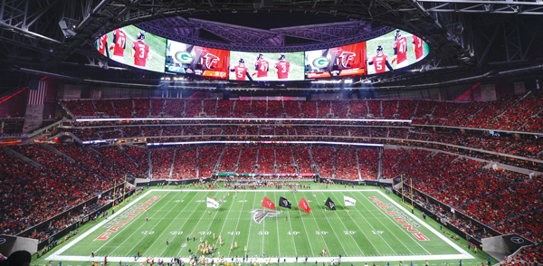
The new Halo Board in Mercedes Benz Stadium in Atlanta is a 360-degree, 62,000-square-foot circular
testament to technological fortitude.

The wonder was how much bigger a video display can get before it intrudes on the actual game that’s happening beneath it. But the crew and the contractors at AMB Group, the parent company of the NFL’s Atlanta Falcons, made that sentiment a moot point while going even bigger with a new idea.

For when the fans look toward the heavens when the Falcons need a dramatic score to win a game, they can send their prayers through Mercedes-Benz Stadium’s (here it comes…) “Halo Board.”

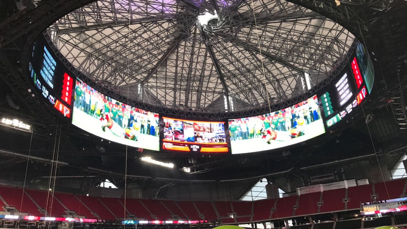
While video displays have been created in various shapes and sizes in recent years, this ensemble is a 360-degree, 62,000-square-foot circular testament to technological fortitude—under a roof that opens like a camera lens and is modeled after the Roman Pantheon. It will offer Falcon fans some interesting opportunities to share video and information, exercise the imagination and sell advertising.

NEW SENSATION
While the Halo Board in Mercedes-Benz Stadium isn’t the first circular-type screen—the outdoor board at Barclays Center in Brooklyn is similar, albeit much smaller and an irregular shape—it’s certainly something new.

“I haven’t seen anything of this magnitude,” said Tyler Jones, senior project manager with Daktronics, of the board that rests within the eight-section mega-circle of the roof that hangs under what’s known as the “Oculus.” He added that the company’s install outside of the Barclays Center gave it “something to draw on for the Atlanta project.”

That had to help the Brookings, S.D.- based company during the bidding process for the job, which commenced after the design of the stadium came back to the Falcons from HOK, a Kansas City, Mo.-based architectural firm.

“We were eventually awarded the job,” said Jones, “and there was a great deal of coordination with all of the people behind the team,” which included HOK Structural, then BuroHappold Engineering and IBM, the technical partner on the stadium that installed a passive optical network comprised of 3,770 miles of groundwork fiber cables.

The “Mega Column” vertical measures 101 feet tall by 71 feet wide.

Jones said Daktronics had “almost three dozen” workers on site; for the sake of comparison, that’s about two dozen more than the company needed five years ago to install the flat board in rightfield at Miami’s Marlins Park.


XXX


Julio Jones torched the
Green Bay Packers for 180 yards and 2 TDs in the 2017 NFC Championship game.


The primary broadcasters for each conference in the NFL have a basic deal when a new stadium opens: If the new venue is in an American Football Conference (AFC) city, carrier CBS Sports oversees the new approach to the broadcasts; if it’s the NFC (National Football Conference), Fox Sports handles that duty.

That means that, in recent seasons, the gang at Fox Sports has had its hands full, with new stadia debuting in the Dallas, New York (where the NFC Giants share MetLife Stadium with the AFC Jets), San Francisco, Minnesota and now Atlanta
markets.


“Each stadium represents a new hallmark,” said Michael Davies, senior vice president of field operations for the NFL on Fox.

And that can call for new angles to be taken when broadcasting from the new venues. “When you think about a facility, from a TV perspective, camera positions haven’t changed that much,” Davies said, “but your look angles have to be good, which can be a challenge with field level suites being built along the low angles and within the common viewing area,” which has been the case in Dallas and is now the case in Atlanta.

The other issue, he said, is that the stadium designers wants to put the fans right on top of the action, but can go about doing so in different ways.
“If you’re watching a game in Dallas”―which is home to two 160-foot by 72-foot Mitsubishi screens, which each span 60 yards―“you’re watching TV, basically,” he said with a laugh, noting that setup is said to be equivalent to a 68-inch screen in a living room. “In Atlanta, they are blending the TV experience and a football experience a little bit more.”
With the Halo Board in Mercedes Benz Stadium located just under the roof and the Mega Column providing an exclamation point in an end zone, Davies seemed mainly concerned with the positioning along the sidelines of the LED ribbon boards.

The key in these situations, he said, is for the builders to keep an eye cast to the future when designing the guts of new facility.

 “These places will be around for the next 20-to-30 years,” he said. “For instance, there is very little copper in [Mercedes Benz Stadium]; it’s almost all fiber. There also have to be parking and loading areas for the trucks of the future.
“They have to be sure that they know that we have to prepare,” said Davies, “for what we don’t know yet.”


As far the construction of the Halo Board is concerned, its shape wasn’t quite the challenge one might think. “We can make the boards about any shape that is needed,” Jones said, “since 14.4 inches per square is our standard and we build around that. Within the Halo, the squares run 48 high and 896 wide,” totaling more than 43,000 squares.

Within the Halo, Daktronics also developed a 277V power option specific to the board, in lieu of the normal 120V power supply. “That allowed the Falcons to forgo using a number of smaller transformers,” said Jones, noting that it is embedded within the display.

The manufacturing process for the Halo Board began at Brookings headquarters in mid-October and ran until early February, and required the talents of more than 100 people to build; the install began in May, with that type of lead time necessary when Daktronics “had 616 pieces to mount in the stadium roof,” Jones said.

IN THE CORNER
Not lost in the buzz about the Halo Board is the “Mega Column,” which rests in the east corner of the stadium, by the massive end zone window that gives fans a panorama of the Atlanta skyline. The vertical display, which measures 101 feet tall by 71 feet wide, wraps around three of the four corners of that column.

“The information technology staff told me that the column has more square footage than the main boards in 17 other NFL stadiums,” Jones said, and it is fully visible to passersby outside the venue.

There is no end zone board on the east or west sides of Mercedes-Benz Stadium, which does include Daktronics ProRail ribbon boards on its north and south sides. They act as the railing for the upper deck and are topped with glass and handrails.

Mike Meglathery, senior project manager for broadcast systems integrator Diversified, described setting up the Halo Board as “technically challenging” for various reasons, not the least of which was obviously its size, which he termed “the equivalent of 12.5 video screens in a circle at 60 feet high, but it’s also a quarter-mile around.

“The biggest challenge was driving an image that can go all the way around it with pixel accuracy and synchronously,” he said. “We had to get all of the boards in sync.”

The Halo Board also required a “first of its kind graphics system” from Ross Video, the Tessera platform, which was developed for the Falcons and designed to offer enhanced IP video routing and connectivity.

The two million square-foot Mercedes Benz Stadium can hold up to 71,000 football fans. Modeled after the Roman Pantheon, it features a roof that opens like a camera lens.

Gus Drosos, technical principal at HOK, Kansas City, also noted the unusual approach that all involved had to take at Mercedes-Benz Stadium. “We had a tall structure” to address, meaning the 14.5-acre roof “was 198 feet above the ground. It became apparent that if we used that real estate to integrate a smooth ellipse, we could create a ‘theatre-in-the-round’ to give the fans a full immersive experience.”

Drosos said that, initially, what became the Halo Board “was segmented, but as we worked with the Falcons, it became apparent that making it round would work.” Thus was the establishmsent of a 70-foot tall board, “with a 10-foot gap on top until you hit the flat roof would work.

“We saw the Halo Board as an opportunity to take the scoreboard out of the line of sight,” he said, and the Falcons “were excited about the possibilities of the board, because the team’s video operators can drive a car or bounce a ball around it. No one has done this, so there is an evolution of ideas going on. The potential for what they can do with this board is unprecedented.”

THE POSSIBILITIES
Drosos also mentioned a social media angle for the display. With a new stadium that features 1,800 wireless access points that allow 75,000 fans to stream concurrently, “wouldn’t it be cool if the team [and the NFL, which would have to set up a protocol] let the fans use social media and integrate them into the Halo Board, or offer them specials?” he mused. “What does this present for other activities? Can you play video games on it? Could you potentially put something on 3D on it and give fans special glasses, if the technology can allow that?”

Jones noted that “the most important thing I learned from this project was that the communication between the architects and designers, as well as the contractors and those who worked in manufacturing, was especially important. That’s what made this happen.

“It’s pushed us forward,” he added, “because there will be more interest in this type of video application. Stadiums are trying to push the envelope and we’re anticipating more interest in this type of design as we move forward.”

Meglathery agreed. “It’s stunning what it does and it will elevate the in-stadium fan experience. This the showpiece video board for America at this point.”

Looking to SKYROCKET YOUR BUSINESS?

Providing all the help needed to effectively promote your business!  

Offering strategic marketing and digital media services for video production, website and print design along with social media marketing delivering cost-effective results in highly competitive markets. If you want a measurable integrated company that cuts across all media channels to engage people and motivate action, then contact or call Kelsey Media Productions at 781-365-4800

View Samples from Kelsey Media Productions Video Gallery!

Promotional 4K Video Production & Marketing

We deliver high quality videos that communicate your message with clarity and impact! Clients come to us because we understand modern business communication and are passionate about what we do.  Whether we are shooting a special event, training seminar, product demo, web video along with a television commercial we’ve got your production needs covered.
 
Services include 4K or HD cameras, original 5.1 music soundtrack production, remote location shooting and multi-camera with live switching. Our studio brings the latest in digital editing offering broadcast quality special effects, video/audio tools, motion graphics and 3D animation  for more Info…

CONTACTING US IS THE FIRST STEP TO Skyrocketing Your Brand!

We enjoy working with clients who are serious about increasing leads and growing their business. Our relationships are long-term and we provide complete solutions. Taking a project from the ground up allows us to maximize results for our clients. Please fill-out our Consultation Form from the link below to get started!