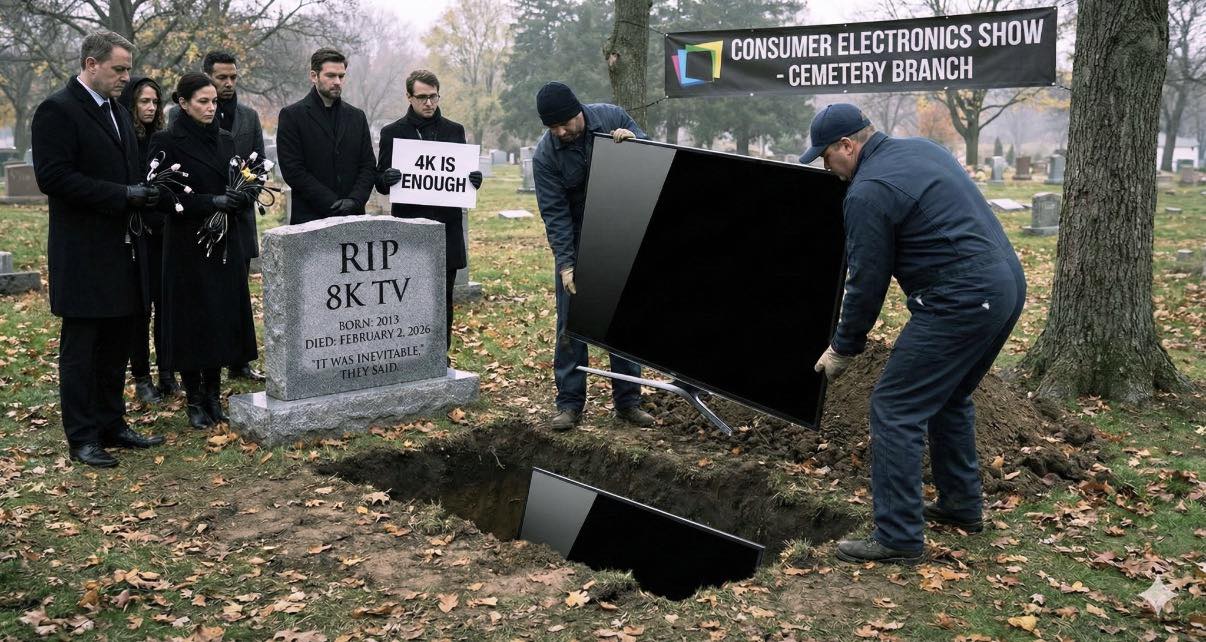
Category Archives: mobile

Web Design Trends 2021: From Dark Mode to Motion

A good article for which web design trends will take the web by storm over the next year? Here are some trends to watch out for in 2021.

Portrait for Kelsie Rimmer  By Kelsie Rimmer
Web Design Trends 2021

Web design has come a long way in the last few years. The practice exists at the intersection of creativity and technology – two of the fastest moving industries in the world – so it’s no surprise that new web design trends and techniques are constantly emerging. So what are the latest trends in web design?

While there will always be certain aspects of web design that are here to stay – such as user-friendly navigation, data security, and fast load times – fads and fashions will continue to come and go. But keeping on top of the latest and greatest web design trends, styles and innovations, will ensure your website stands out in the ever-expanding online ecosystem.

So, from dark mode to interactivity, which popular web design trends will take the web by storm over the next year? We asked our Envato experts what makes a great website in 2020, as well as their hot take on the latest and greatest web design trends to watch out for in 2021….

01. Dark mode

Apple Website
Dark Mode – Apple Homepage

For a long time in web design, a white background was considered the only way to create empty space on a website or app. While some designers began adding darker themes and elements several years ago, the Dark Mode trend really took hold of the industry in 2020, and we expect to see it continue into 2021.

What Is Dark Mode?

Clock Strikes Twelve
Dark Mode – Clock Strikes Twelve Homepage

Used by large brands like Apple, Hublot, and even for individual portfolios like Clock Strikes Twelve, dark mode is a great way to add a modern, elegant touch to any website. As well as allowing designers to play with more creative elements, such as pastels and neon – two of the big graphic design trends of 2020 – studies have also shown that dark mode is better for both our battery life and our vision by it reducing blue light exposure.

“There seems to be a shift towards more products that offer a dark mode setting, or are only dark driven, based on studies that reveal the impacts of glare and blue light exposure, and on our treasured battery life,” says Envato UI designer Sean Feehan.

As well as being sleek, chic and easier on the eyes, dark mode is great for increasing contrast, and making design elements more visible. You can even add a dark mode toggle to your website – as seen in these examples from Johny Vino, Koos Looijesteijn and Adrian Verde Studio – to allow visitors to customize their experience.

Johny Vino - Dark Mode Toggle
Dark Mode Toggle – Johny Vino Homepage

“I think dark mode is definitely the trend that’s had the biggest impact on web design in 2020,” says Envato UX designer, Tahlia Giannopoulas. “Since Dark mode has become popular, I’ve seen several websites that have a small ‘Dark Mode’ toggle (switching between light and dark mode), which is a great yet simple way that a user can customise their experience.”

While originally designed around exclusively white and light color schemes, more and more neuromorphic designs – a divisive UX style drawing on skeuomorphism and flat design that’s often seen in iOS or Android UI – also incorporate the dark mode trend, which has quickly overtaken lighter color themes in popularity.

To cross over to the dark (mode) side, check out this Dashboard UI Concept Dark Theme by hoangpts, Finance Wallet Dark Mode UI Kit PP by angelbi88 and this Spate Ui Kit by cerpow on Envato Elements!

02. Collage & Mixing Mediums

Collage - City Circus Website
Collage – City Circus Homepage

Collage was one of the biggest trends to take over the graphic design and social media landscape this year, and it’s quickly caught on in the world of web design. The mixed media style returned to the spotlight due to digital artists and social media influencers, and was also adopted by many brands and web designers – including Chobani, City Circus and Urban Outfitters.

What Is Collage?

Collage - City Circus Website
Collage – City Circus Booking Page

Collage is all about mixing mediums such as photos, illustrations, graphics, motion and text to create an inspiring and eye-catching aesthetic.

Now that it’s moved into the digital realm, the collage trend has evolved into mixed media such as animated collage, large decorative fonts, artistic textures (such as paint brush strokes) and even animated distorted text, which generate some incredibly unique results.

“I think the concept of mixing mediums will only get bigger in 2021,” says Tahlia. “Heaps of people are now using drawing apps on iPads, and with digital brushes that mimic traditional paint mediums (such as watercolors, oils, gouache), the boundaries of digital art are being redefined. Also, the added convenience of having digital art already on your device (not having to worry about photographing or scanning it) means it’s easier than ever to share on the web.”

Collage - Urban Outfitters Website
Collage – Urban Outfitters Homepage

Collage is a trend that pairs well with minimal UX design – or even anti-design if you want to push those boundaries. Integrating mixed media and collage into your website design is a surefire way to add a splash of creativity to an otherwise ordinary experience and make your brand or business stand out.

To integrate collage into your next web design, check out this Brynn Creative Portfolio Theme, this Bridge – Creative Multipurpose WordPress Theme, or this Boldlab – Creative Agency Theme on ThemeForest. Or, check out these great collage-inspired items on Envato Elements!

03. Anti-Design

Anti Design - Roze Bunker Homepage
Anti Design – Roze Bunker Homepage

Warning: we know this trend isn’t for everybody!

If 2020 has taught us anything, it’s to throw all rules and expectations out the window. Anti-design is a trend that was spurred on by the resurgence of Brutalism in 2019, and the controversial style has more recently seeped into the realms of social media and pop-culture, as well as web and graphic design.

Anti Design - Play Type Homepage
Anti Design – Play Type Homepage

What is Anti-Design?

Described as ‘raw’, ‘unapologetic’ and even ‘hideous’, the anti design movement is all about embracing chaos and ugliness in protest of the traditional standards of ‘good’ design. It features experimental and asymmetrical layouts, exaggeration, distortion, layering and traditionally ‘ugly’ elements, which means it’s certainly not everybody’s cup of tea. But if you’re someone who likes to stand out from the crowd, there’s no denying that an anti-design website is a very effective tool for doing just that!

Anti Design - XXIX Homepage
Anti Design – XXIX Homepage

Many designers are now dabbling in the bizarre world of anti-design, which can be seen in the chaotic yet quirky website designs of Dutch brand Roze Bunker, and design studios Play Type and XXIX. Even Aussie artist Flume has taken a bright, bold and brutalist approach with his website. While this style always stands out (hopefully for the right reasons), effective web design is about balance. So, if you do choose to go down the road of anti-design in your UI, it’s important to ensure that the UX of your website is still simple, functional and user friendly.

Anti Design - Dynamic MTL Homepage
Anti Design – Dynamic MTL Homepage

“I thought the anti-design trend might die down, but I think ‘Breaking the Rules’ has evolved along with collage and mixed media,” says Tahlia. “I have come across a lot of different websites that are layering imagery, mixing serifs with san serif font, and using animation in an unconventional way. Yet, because of their great UX, they still make it work.”

04. Minimalism

Minimalism - ETQ Homepage
Minimalism – ETQ Homepage

A design trend that absolutely refuses to quit, minimalism has become the bread and butter of the work of web designers over the last decade. But what is minimalist web design? Less a visual style and more a design principle, minimalist design is based around using only the essential elements – such as basic shapes, clean text, limited color palettes and empty space – to create something simple, functional and memorable.

Minimalism - Huge Inc. Homepage
Minimalism – Huge Inc. Homepage

Many brands have been executing the minimalism trend beautifully in their web designs, such as luxe shoe label ETQ Amsterdam and Brooklyn-based business development agency Huge Inc. While typically associated with monochrome and white space, minimalism isn’t just black and white. In fact, colorful minimalism is on the rise in both graphic and web design, featuring block colors and bold backgrounds, simple sans serif fonts and minimalist typefaces, as well as minimal design elements to create a simple yet stunning website design.

Minimalism - Huge Inc. Action Page
Minimalism – Huge Inc. Action Page

A trend that aims to not only simplify website visual design, but usability and functionality – another big trend pegged for 2021 – minimalist web design will continue to be a key component of modern UI design for years to come.

“I’m not big on trends, but I believe that minimalism will always be relevant in the digital design space,” says Sean. “The more we overcomplicate our interfaces, the more users will struggle to use our products.”

05. Organic Design

Organic Design - Ora Homepage
Organic Design – Ora Homepage

One of the biggest design trends of 2020, organic design is all about using nature and the world around us as inspiration. While frequently seen in product design, interior design and graphic design, this trend is now starting to gain momentum in the world of web design too.

The Organic design trend is influenced by an increased focus on sustainability and environmentalism, featuring warm, earthy colors, natural shapes and raw organic textures – as spotted on these websites from Ora Floral Agency, A Better Source, and Melbourne’s Abbotsford Convent.

Organic Design - Abbotsford Convent 'What's On' Page
Organic Design – Abbotsford Convent ‘What’s On’ Page

Neutral colors replicate our environment’s natural palette, and are one of the easiest and most effective ways to add a more organic feel to your website. Alongside soft browns, beiges and whites, faded pinks, blues, and greens can also be great additions to a neutral color palette, which can be used on their own or paired with brighter colors to make them pop.

Organic Design - A Better Source Product Page
Organic Design – A Better Source Product Page

“I have noticed quite a few websites shift towards earthy warm color palettes, which is a welcome change from the bright cool tones we usually see dominating our screens,” says Tahlia.

06. Illustration

Illustration - AHM Homepage
Illustration – AHM Homepage

Illustration has absolutely exploded this year across graphic design, social media and web design. Plenty of brands, businesses and creators are catching on to the popularity of illustration and digital art, with many now integrating hand-drawn elements into their website designs – including the likes of health insurance company AHM and even luxury fashion brand Gucci.

Following on from organic design, illustrations are great for adding a crafty, authentic touch to your web design and give your website a welcoming feel. With an increased focus on diversity and representation in design in 2020, many illustrators are now featuring quirky people of all shapes and sizes, a style commonly referred to as “odd bodies”.

Illustration - Huge Inc. Research Page
Illustration – Huge Inc. Research Page

3D illustrator and Elements author Amrit Pal Singh is a big advocate for these more quirky and inclusiveillustrations, focusing on diversity, individuality and representation in his work.

3D Illustration - AmritPalDesign's Website
3D Illustration – AmritPalDesign’s Website

“Illustrations and character design over the years have really established wrong standards of beauty and importance. Almond-eyes, fair skin, and particular body types; we have grown up watching cartoons that establish these biases,” says Amrit. “As creators and artists, it’s our duty to fix that. We need to consciously think about representation at every stage. I’m always trying to make my work more diverse and inclusive.”

07. Functionality, Inclusivity & Accessibility

Functionality - Blue Receipt Homepage
Functionality – Blue Receipt Homepage

Website functionality has always been a key aspect of web design. However, along with fast load times, page speed, and mobile-friendly design, an increased focus on inclusivity and accessibility have created a growing need for web design to factor in the needs of people with disabilities, and make websites accessible and functional for all.

Accessibility - Blue Receipt Product Page
Accessibility – Blue Receipt Product Page

Luckily, accessible web design is being adopted by more brands and businesses – such as e-commerce hub Blue Receipt and no-fuss cat food brand Cat Person – and having a functional, accessible and user-friendly website that any visitor can easily navigate is now essential for providing an effective online experience.

Accessibility - Cat Person Product Page
Accessibility – Cat Person Product Page

Optimizing your website to be more functional, accessible and inclusive is not just good for customer service – it also increases conversion, boosts your SEO, and extends your audience reach.

Some ways to make your website more inclusive and accessible include:

  • Creating strong color contrast between text and backgrounds;
  • Adding focus indicators, such as the rectangular outline that shows up around links when using keyboard navigation;
  • Using labels and instructions with form fields rather than low-context placeholder text;
  • Using functional alt tags for images;
  • Featuring easy-to-understand, straightforward, and jargon-free copy.

“On the whole, I have seen a real raising of the bar in well designed, functional, accessible websites which is really positive,” says Sean. “I’ve observed this through higher contrast colours, large typography, authentic, relatable copy, big buttons, and soft curved UI elements. I somewhat optimistically believe this is due to a growing understanding and appreciation of the value good design can add to businesses.”

To make your web designs more functional and inclusive, try this Accessible Business Portfolio & WooCommerce WordPress Theme, Product Designer WordPress Theme for WooCommerce or this Voicer – Text to Speech Plugin for WordPress on CodeCanyon. Or, check out more items below on Envato Elements!

08. Motion & Interactivity

Motion - Gridspace Homepage
Motion – Gridspace Homepage

Video is proven to be the most engaging form of content online, so it’s no surprise that motion has also become a big trend in web design. Used everywhere from boutique websites such as Alter Mind and Gridspace to SEEK’s career advice page, motion and animation in web design is a simple way to make an otherwise ordinary web page more exciting and engaging.

In a similar vein, many brands and businesses – such as YouTube Rewind – have begun adding more interactive elements to their websites, including quizzes, games, polls and surveys. A great example is Estee Lauder, whose website features an interactive arcade game called ‘THE ANRCADE’ – a futuristic quest focused on earning ‘youth-generating power points’ to promote their Advanced Night Repair cream.

Interactivity - Estee Lauder's ANRCADE Game
Interactivity – Estee Lauder’s ANRCADE Game

In addition to being a fun addition to the online experience, interactivity is a great way to engage your visitors while also learning more about them. However, it’s important to achieve balance and ensure your motion or interactive elements don’t dominate or distract from the purpose of your website.

Interactivity - YouTube Rewind's Global Search Page
Interactivity – YouTube Rewind’s Global Search Page

“As technology continues to improve it is becoming easier to utilize and apply motion to your designs, which can make for delightful experiences (when used appropriately),” says Sean. “I see this done well when transitioning between content, and interacting with elements.”

To add more motion and interactivity into your website, check out this Lottie Animation for Elementor by merkulove, Animated Typography by motionbeard, and this Scribble Elements by FlashFXbox on Envato Elements!

09. 3D & Geometric Design

3D Floating Objects - The Artery Homepage
3D Floating Objects – The Artery Homepage

Geometric patterns and elements are frequently used in the world of modern web design – including classic flat shapes such as polygons, diamonds, rectangles, triangles, and the occasional rhombus. However, the geometric web design trend has evolved to also include  more modern elements such as 3D shapes, floating objects and visible gridlines.

Geometric Design - The Imagineers Homepage
Geometric Design – The Imagineers Homepage

The use of 3D shapes and floating objects in geometric design blends surreal motion with realistic objects, creating a mesmerizing, futuristic effect – a style popularized by the suspended, rotating movement often used in tech commercials to show off new products. This is perfect for adding another layer or dimension to your web design, to ensure your website captivates your visitors  – as seen in this website by The Artery, which pairs geometric elements with minimalist, simple gridlines to lay out their website.

3D Floating Objects - The Artery Design Lab Page
3D Floating Objects – The Artery Design Lab Page

In contrast to the complex nature of 3D and floating objects, the use of simplic grid lines, borders and other structural elements has also become a trending style in the web design space – such as in these websites by Rail Road Ladies, Monograph Comms and The Imagineers.

Geometric Design - The Railroad Ladies
Geometric Design – The Railroad Ladies

“I’ve also noticed a resurgence of more geometric elements and visible grid lines in web design, which I’m kind of into as someone who loves structure and order,” says Sean.

Envato Elements - Connected - Landing Page by cerpow

10. WordPress Page Builders & Template Kits

In the last few years, self-serve website templates and page builders have increased in popularity. Website builders such as Elementor and WordPress Gutenberg mean that, nowadays, even the least tech-savvy or design-minded person can create a professional website in no time.

Kaleo - Creative Portfolio Template Kit
Kaleo – Creative Portfolio Template Kit

Page builders are fast, code-free and fully flexible, offering professional layouts and limitless customization for those without design or coding knowledge.

With a little something for everyone, Envato Elements Template Kits for Elementor offer a wide variety of professional and cohesive website designs and templates for everything from your homepage to your contact page. Envato’s new category of pre-designed templates are designed to go hand-in-hand with your WordPress page builder – which makes it super easy to get a website up and running in no time.

The Restaurant - Elementor Template Kit
The Restaurant – Elementor Template Kit

To build your own WordPress website, check out these top 10 Template Kits for Elementor, or try out some of the Template Kits below…

Reformoa - Architecture & Interior Design Elementor Template Kit
Reformoa – Architecture & Interior Design Elementor Template Kit

OSMO Pocket Video Camera by DJI

We recently got a hold of the Osmo Pocket 4K Video Camera by DJI and were quite impressed! The DJI Osmo Pocket puts video stabilization in the palm of your hand, with a small camera that smooths out your footage thanks to a 3-axis gimbal. It’s pocketable, like the name suggests, and doesn’t hog your smartphone, like the larger DJI Osmo Mobile 2. The fluid 4K resolution is ideal for anyone who uploads to YouTube, yet hates the idea of being shackled to professional-sized camera stabilization equipment. It’s not as durable as a GoPro and its microphone isn’t the best, but our testing proved that it’s the real ‘hero’ of smooth video and video transfer speeds.

Video below was produced by Kelsey Media Productions from footage we shot at the play date opening for Encore Boston Harbor located in Massachusetts. Video was shot with a DJI Osmo Pocket camera in 4K @ 60fps. Kelsey Media Productions

A camera that can be used for steady B-Roll footage along with having a small compact design makes it a great camera for on-the-go shooting or vacation fun!

Videos Get More Views!

The one format that is driving significantly higher shares on social media is video. This may be due to Facebook’s focus on video, the auto-playing of videos and similar factors but whatever the reason videos get more views.

If you are looking to increase your Facebook reach and shares, or at least to maintain your shares you need to be looking at video content. Top publishers are already increasing their Facebook video output. What is your Facebook video strategy? Looking for help then contact Kelsey Media Productions so that we can produce and market your next promotional video call 781-365-4800 or visit www.kelseypro.com

Facebook Adapts to 4K Video…. If you’re sick of your beautiful videos looking crummy on Facebook, there’s good news for you. After some super HD videos started popping up on the social network, Facebook now confirms to TechCrunch it’s testing 4K video uploads and viewing using the 2160p UHD-1 Ultra-High-Definition Television standard. Some Pages and profiles can now post 4K videos to Facebook, as well as watch them. It’s been a long time coming, considering YouTube first started experimenting with 4K video playback in 2010.

Facebook launched 4K support for Live 360 videos in July, but its standard 2D videos have long been capped at 720p. That was fine for most of the stuff users shot on their phones. But with Facebook video now attracting high-frames-per-second video game streamers and professional Hollywood content creators, it needed to get with the program.

You can make sure you’re watching on the maximum resolution by hitting the gear icon on a Facebook video and switching to 2160p, aka 4K, if it’s available.

Mobile internet use passes desktop for the first time!

More users around the world are accessing the internet from mobile devices than from desktop computers for the first time, according to internet monitoring firm StatCounter. The combined traffic from mobile and tablet devices tipped the balance at 51.2 percent, vs. 48.7 percent for desktop access, marking the first time this has happened since StatCounter began tracking stats for internet usage.

It’s a huge moment for the web overall: this means going forward, companies that haven’t yet decided to focus on a mobile-first approach to their internet services and web properties really should, as the trend line is unlikely to reverse.

StatCounter also found that the maturity of the market impacts which is the dominant means of access, and as you might have guessed, mobile platforms are far and away the method of choice for internet access when it comes to emerging markets like India, where they account for 75 percent of use. More mature markets including the UK, the US and Ireland still see use swinging in favor of desktop, but the trend is still showing a narrowing gap.

internet_usage_2009_2016_ww

This is not surprising news, given other recent milestones. In April last year, for instance, comScore found that the number of internet users who employ mobile platforms exclusively has surpassed those who only connect via desktop in the US (this doesn’t consider users who access via both methods). And Google revealed that more searches through its engine are being conducted via mobile platforms than on desktop as of last May.

This may have been a long time coming, but it’s still astounding how many major brands (including possibly our own) favor the desktop first and prioritize mobile web second. Maybe now that this tipping point has been achieved, that will start to change a lot faster.

5 Advanced SEO Strategies You’re Probably Aren’t Using

BY PETER ROESLER
These simple but overlooked tactics can help boost your site’s traffic and revenue.

A lot of businesses have had their current websites for several years and while they may be functional, they may not be optimized for SEO in the current environment. SEO is a fast changing field, and even a site that was perfect a couple of years ago may be out of date when it comes to strategy and best practices. Many articles have covered simple things a business owner can do to improve their site’s SEO and internet marketing, this article will focus on a few advanced topics. Here are five advanced SEO strategies you probably aren’t using.

Business man point the text: What's your Online Mkt Strategy?


  1. Optimize PDFs for SEO
    Many people don’t realize that Google treats the PDFs on websites like webpages. Not just indexing the title of the file, but the contents within as well. For a start, this means that businesses should use keywords as they would on any other page on the site. Also, the PDFs on the site to promote can advance the company’s content marketing and SEO goals. Marketers should include keywords in their headings, give the file an SEO-friendly file name, and include all meta description options available when creating the file. Since, the links within the document count when clicked, be sure to include links back to the website in the logo (like you would on the website) and links to supporting content on the site. Finally, be sure to include as much text as possible and not rely too much on images. Google can read a pdf, but it still can’t assign an SEO score for a picture other than the information in the alt tag. So be sure to include a description to go with your graphics if you want the information to be easy to find through search.
  2. Use Paid Promotion on Social Media to Boost Traffic
    Business owners often want to improve their SEO rankings so they can increase their website traffic, but in some ways, that’s putting the cart before the horse. Google and other search engine algorithms take into account how much traffic a page gets when determining its ranking. So increases traffic to a site will boost its SEO, which in turn, boosts the traffic even higher. Social media is a great way to get the ball rolling. Most social media platforms have some form of paid promotion or ads that can be used to increase traffic. Business owners and marketers need to take advantage of these tools so they can find their target audience and lead them to their site. So long as the content is original and interesting to the audience and the targeting is done right, business owners can send a large amount of traffic for a small amount of money. And if people like what they see, they’ll come back to see more and share the link with friends. This sort of activity will boost a site’s SEO ranking.
  3. Continuously Create Quality Content
    There are a lot of ways that website owners can improve the structure of their site and SEO-friendliness of the content, but the one algorithm-proof method to improve a site’s search ranking is to continuously create content that’s useful to the audience. Though it may take effort and resources, businesses should endeavor to create blog posts and other forms of content for their site on a regular basis. This benefits the site in several ways. First, the SEO visibility of a site increases with the number of pages indexed, so continuously adding content provides more content for search engines to index. Secondly, creating blog posts that are topical, interesting or that answers a question takes advantage in the changes in the way people search and use the internet. People are searching for the answers to specific questions or looking for interesting things to share with their friends. Creating this kind of popular content will serve a business better than the most SEO-optimized traditional About Us page. Just be sure that the created content is SEO friendly.
  4. Use Niche Directories
    Many website owners are guilty of throwing the baby out with the bathwater. At one point, directories were a large part of SEO, but now being listed in the wrong kind of directory can lead to a Google penalty. Understandably, many website owners have avoided all directories to be safe. However, this is overkill and deprives businesses of a very useful tactic. Niche directories are small directories created to serve a very specific community. If you’re a maker of handmade goods or the producer of organic foods, there are people looking at niche directories trying to find these kinds of sites. As long as the directory is targeted and useful, it’s okay with Google. Do a local search for your industry and see what directories come up and submit your site.
  5. Focus on Neighborhoods to Improve Local
    Local businesses are getting better at using the internet to find customers and changes to the Google algorithm for local search rewards small local businesses. For example, Google now divides more cities into subdivisions instead of considering each city as one unit. This means that businesses that identify their location within the city can turn up in important searches for local businesses. Businesses should try to keep a consistent name, address and phone number. Changing the NAP of a business makes it harder for Google to accurately place the business in local search radii. Additionally, businesses should include their neighborhood in website copy and marketing. This helps if someone searches for something like “deli near Southside Pittsburgh”. Also, be aware of nicknames and other ways the neighborhood could be identified, such as the dozens of nicknames for the different areas within areas of Manahattan (e.g. The Diamond District in Midtown).

So those were five advanced tips for SEO you may not be using. I hope you learned something new. If you didn’t learn anything but read to the end anyway, thanks for sticking around. For  a wide variety of services that can be helpful to your business contact Kelsey Media Productions.

This Google Change Hits Small Businesses. Are You Ready?

Most of our clients have already taken care of having a mobile-ready website for their business. Just in case you or somebody you may know who is not aware that this has really happened. So stop what you’re doing, ’cause we’re about to ruin the image and the style that you’re used to.

No really. This is big. And it just happened last week.

First thing’s first: Test your site’s mobile-friendliness RIGHT NOW.

Not long ago Google announced that as of April 21 “we will be expanding our use of mobile-friendliness as a ranking signal.” That’s a major change.

But what does that mean exactly?It means that preferential ranking treatment is now given to sites that are “optimized” for mobile. It also means that having a mobile-friendly website is no longer a nice option to give your customer—it’s absolutely essential.

The good news is it’s pretty easy to see if your site makes the grade…

Take the Google Mobile Test Now!

Read Article from Google

If your business does not have a mobile website and will be affected by losing search presence on Google – Kelsey Media Productions can help!

We have designed several mobile-friendly websites that can work seamlessly with your existing website design.

KELSEY MEDIA PRODUCTIONS MOBILE WEB DESIGN SERVICES

Our web design services including mobile come with a One-Time cost with NO Monthly Fees!

If you need more information then Get your burning questions answered by our experts at 781.365.4800.

If you are also looking for a new website that works on desktop PC, Tablets, iPad and all smart phones… then look no further!

The Awesome Power of Mobile Devices for Local Marketing!

by Peter Roesler

Understanding consumer behavior is an important part of marketing. The way business owner see and expect from consumer behavior is shown by their actions. These beliefs about consumer behavior are normally based hearsay and intuition, since small business owners usually lack the resources need for large-scale consumer expectations survey. A new study from the Local Search Association does a lot of the heavy lifting by showing how consumers use their mobile devices.  This article will review some of the major takeaways from this study and how marketers can use them.

The information comes from a collaboration between Burke, Inc. and the Local Search Association based on 2013 statistics from their annual “Local Media Tracking Study,” The study analyzed the reach of various local media sources across computer/laptop, mobile phone/smartphone and netbook/tablet.

The study is based on interviews with 8,000 U.S. adults conducted online and by phone. The Local Search Association recently released infographics that highlight data that shows more consumers turn to mobile devices when seeking, discovering or considering local business information.

The main takeaway for marketers from this information is that mobile marketing is becoming the prefered channel for many consumers who would once have used desktops and laptops to learn about and engage with companies. This means that mobile marketing isn’t bringing in entirely new customers by reaching people who were previously unreachable. The growth in mobile device usage correlates with a decline in desktop and laptop usage.

To illustrate, the percentage of people using computers and laptops for searching for local products and services dropped from 80 percent to 73 percent between 2012 and 2013. On the other hand,le mobile device usage increased from 25 percent to 34 percent and netbook/tablet usage rose from 6 percent to 11 percent.

It also important to note that desktops are still the most preferred source for looking up information. However, the clear trend is that desktop computing is becoming less important as mobile marketing grows. Also, searches through mobile devices are more likely to lead to a sale. Searches from mobile devices were more than 20 percent more likely to result in a local purchase. According to the research, 78 percent of mobile phone searches led to a local purchase, compared to 61 percent for desktops and laptops.

SEL-41-800x452

One of the reasons mobile marketing is becoming so important relates to the technology involved. While there are certainly new technology for TV and radio advertising, mobile devices offer the greatest advantage to marketers.

“As customer touchpoints expand, retailers continue to investigate other ways to diversify their marketing spend, including budgeting for increased spend for text advertisements, display ads, social, and attribution models,” said Shop.org Executive Director Vicki Cantrell.

Cantrell’s comments fit in with another takeaway from the Local Search Association study. The study found that why search was easily the most popular reason people were drawn to a retailer, there were a lot of marketing options that each brought in a significant amount of business to a company. Mobile marketing can easily be integrated with these other tactics so business owners can offer coupons, use email marketing, promote content on social media and more.

SEL-61-800x495

This research shows why mobile marketing is so important to small and local business. When looking at long-term trends, it’s clear that mobile devices will become more important than desktops and laptops in the future. Also, the best way to reach a large number of consumers is to a use a diversified marketing strategy. Mobile marketing can help with this because these devices can be used as platforms for email, social and content marketing.

BASIC 3 POINT LIGHTING FOR VIDEO & FILM

Poorly lit scenes can leave your project looking flat and lifeless. But if you can get the lighting right, it will help establish a tone, and bring the depth and texture to your footage. In this segment, we talk about the basics of 3 and 4-point lighting including key lights, fill lights, backlights and set lights. Plus, some insight into hard light and soft light, and high key and low key lighting styles. Knowing the fundamentals of basic lighting setups can help breathe life into bland scene.

Creating the Film Noire Look (High and Low Key Lighting)

Color Temperature and Lighting

Gels and Diffusion: Everything You Should Know

Businesses looking to design a new website this is a must!

Our responsive web designs work effectively across all Pc and mobile devices.

One Website, Many Devices

Kelsey Media Productions is now offering – Responsive Websites! What is a Responsive Website? In simple terms, a responsive web design uses “media queries” to figure out what resolution of device it’s being served on. Flexible images and fluid grids then size correctly to fit the screen. One of the most appealing aspects of responsive web design is that a responsive website can provide a great user-experience across many devices and screen sizes. This is an important characteristic, since it is impossible to anticipate all the devices and screen sizes searchers will use to access your site. A site that works well regardless of these variables will provide a better and more consistent user-experience than a separate mobile site that is designed for a specific device and screen size.

Let’s take the following example. Someone searches for a product on their smartphone during a lunch break at work. They find a site that has the product they’re looking for, and decide to continue researching this product on the same site when they get home. Except, when they get home, they will use their desktop instead of their smartphone.

If the site in this example is responsive, this person will have a positive user-experience when transitioning from mobile to desktop because they will view the same site on their desktop as they did on their smartphone. On the other hand, if the site is a dedicated mobile site, this person will become frustrated with the fact that they have to locate the desktop version of the site, and find the product all over again.

Easier to Manage

Having a separate desktop and mobile site requires having separate SEO campaigns. Managing one site and one SEO campaign is far easier than managing two sites and two SEO campaigns. This is a key advantage a responsive website has over a separate mobile site.

That being said, there are benefits to having a mobile-specific SEO strategy, such as optimizing for keywords that are more likely to be searched when someone is on their smartphone.

For example, someone performing a mobile search for a local restaurant may be more inclined to use the word “nearby” in their search query. However, a separate mobile site is not a requirement for a mobile SEO strategy, and there’s no reason why mobile-specific keywords can’t be incorporated into a responsive design site as well.

Conclusion

Responsive web design is recommended by Google, it allows one website to provide a great user-experience across many devices and screen sizes, and it also makes managing your SEO strategy easier. For these reasons, responsive web design is the best option for your mobile SEO strategy.

The benefits are obvious: You build a website once and it works seamlessly across thousands of different screens. Given the rapid adoption of tablets and smartphones — and the fact that users currently seem to prefer finding businesses, restaurants and reading their news on the mobile web rather than in apps — I think it’s inevitable that responsive design is taking off. For business owners, it offers the simplest way to reach customers across multiple devices. For users, it ensures a great experience on every screen. For quality results, contact us or call 781.365.4800 for your free consultation or check out some of our responsive web site projects at Kelsey Media Productions.

Welcome Our New Affiliation!

Take a look at BostonMobileWebsite.com affiliated with Kelsey Media Productions creative marketing group. Marketing strategies and digital media services for small and large businesses – call 781.365.4800 for a free consultation.

Screen Shot 2013-08-14 at 8.23.29 AM