Tag Archives: kelsey media productions

Creating online awareness with video slide shows and HD Templates!

Video is still the most popular media that is viewed on the internet. Giving that everyone is turning to online video…. a good video is the most effective way to educate the user about your product or help promote your business. This video slide show produced by Kelsey Media Productions features a variety of Valentine’s Day Cupcakes from Nancy The Cupcake Lady located in Bellmore, New York.

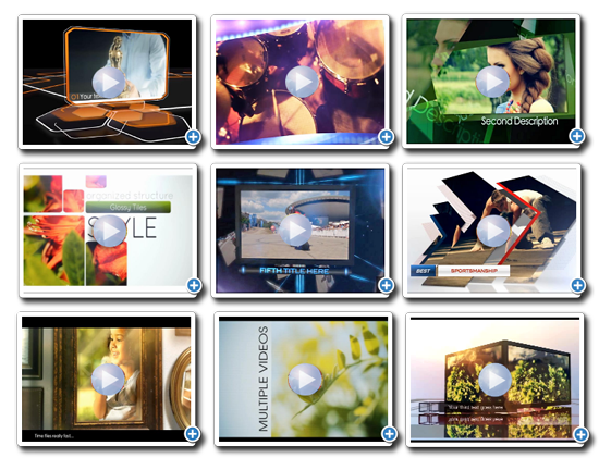
We recommend our custom templates to clients because it’s fast and easy to add professional, customizable motion graphics to a project. These high quality Animated HD Video Templates can help build awareness to your business, products and services. The custom template samples from our website can be included in your production. Our HD Templates can utilize Video Footage, Content, Photo Stills, your selected Music and company logo. Your completed video production can be viewed on your Website, Blog, YouTube, Vimeo, Facebook used within a Presentation or added to a television spot. In addition to being a great marketing tool these animated templates are visually stunning and professional.

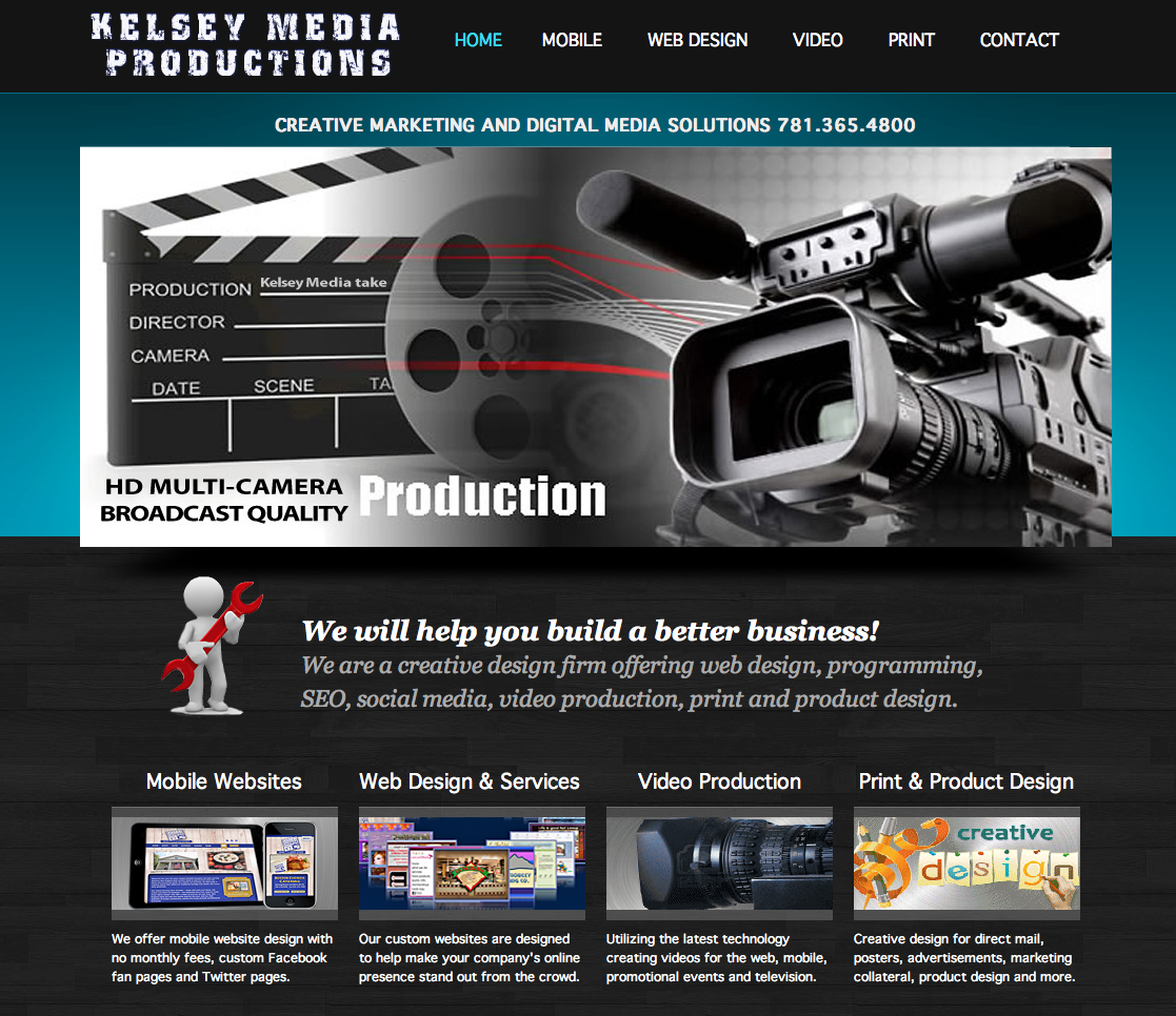
Are you looking to add some excitement to your products, services or business – then give us a call at 781.365.4800 or visit Kelsey Media Productions!

Businesses looking to design a new website this is a must!

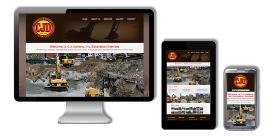
Our responsive web designs work effectively across all Pc and mobile devices.

One Website, Many Devices

Kelsey Media Productions is now offering – Responsive Websites! What is a Responsive Website? In simple terms, a responsive web design uses “media queries” to figure out what resolution of device it’s being served on. Flexible images and fluid grids then size correctly to fit the screen. One of the most appealing aspects of responsive web design is that a responsive website can provide a great user-experience across many devices and screen sizes. This is an important characteristic, since it is impossible to anticipate all the devices and screen sizes searchers will use to access your site. A site that works well regardless of these variables will provide a better and more consistent user-experience than a separate mobile site that is designed for a specific device and screen size.

Let’s take the following example. Someone searches for a product on their smartphone during a lunch break at work. They find a site that has the product they’re looking for, and decide to continue researching this product on the same site when they get home. Except, when they get home, they will use their desktop instead of their smartphone.

If the site in this example is responsive, this person will have a positive user-experience when transitioning from mobile to desktop because they will view the same site on their desktop as they did on their smartphone. On the other hand, if the site is a dedicated mobile site, this person will become frustrated with the fact that they have to locate the desktop version of the site, and find the product all over again.

Easier to Manage

Having a separate desktop and mobile site requires having separate SEO campaigns. Managing one site and one SEO campaign is far easier than managing two sites and two SEO campaigns. This is a key advantage a responsive website has over a separate mobile site.

That being said, there are benefits to having a mobile-specific SEO strategy, such as optimizing for keywords that are more likely to be searched when someone is on their smartphone.

For example, someone performing a mobile search for a local restaurant may be more inclined to use the word “nearby” in their search query. However, a separate mobile site is not a requirement for a mobile SEO strategy, and there’s no reason why mobile-specific keywords can’t be incorporated into a responsive design site as well.

Conclusion

Responsive web design is recommended by Google, it allows one website to provide a great user-experience across many devices and screen sizes, and it also makes managing your SEO strategy easier. For these reasons, responsive web design is the best option for your mobile SEO strategy.

The benefits are obvious: You build a website once and it works seamlessly across thousands of different screens. Given the rapid adoption of tablets and smartphones — and the fact that users currently seem to prefer finding businesses, restaurants and reading their news on the mobile web rather than in apps — I think it’s inevitable that responsive design is taking off. For business owners, it offers the simplest way to reach customers across multiple devices. For users, it ensures a great experience on every screen. For quality results, contact us or call 781.365.4800 for your free consultation or check out some of our responsive web site projects at Kelsey Media Productions.

Welcome Our New Affiliation!

Take a look at BostonMobileWebsite.com affiliated with Kelsey Media Productions creative marketing group. Marketing strategies and digital media services for small and large businesses – call 781.365.4800 for a free consultation.

Screen Shot 2013-08-14 at 8.23.29 AM

Multi-viewpoint robotic camera system creates real ‘bullet time’ slow motion replays.


This multi-viewpoint robotic camera system, under development by NHK, links the motion of eight sub-cameras to that of an individual camera, so that all the cameras film the same moving object.

“Using this system, you can create the effect of stopping time, and moving the viewpoint all around the subject.”

“Previous methods used a fixed camera, so they could only capture subjects moving in a narrow or limited space. But this multi-viewpoint robot camera system can film dynamically moving sports, or subjects at lots of locations in an extensive space.”

Each robot camera has two motors, for pan and tilt. The cameras also share lens data, so they can zoom in unison.

“Pictures taken with robot cameras inevitably have discrepancies in direction control. So simply switching between them doesn’t give smooth pictures. To solve that problem, we’ve brought in a computer, which redoes the direction control virtually. Image processing is done, to virtually orient the cameras in the direction of the subject, making it possible to switch between the cameras.”

“Pictures from this system can be sent out about one minute after filming is finished. First of all, we intend to use this for live sports broadcasting. We’d like to make it easy to understand what’s happening, by providing multi-viewpoint pictures instead of the current slow-motion replay.”

This multi-viewpoint robotic camera system can also be used as an image capture system for integral 3D TV, under development by NHK. By generating integral 3D video from multiple-viewpoint footage, 3D video of sports events will be viewable on integral 3D TV.